Feeds:
Posts
Comments

Posts Tagged ‘novel’

Create panels, pencil sketches, inks and initial speech balloons/captions in GIMP. Graphic size – 3300 X 4400 pixels, 1200 PPI. When creating a new file, click ‘+’ sign next to the ‘Advanced Options’ and enter values as following:
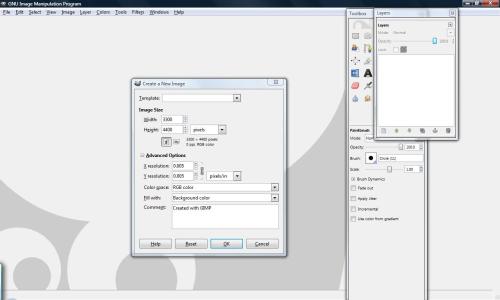
GIMP_screenshot

Creating panels, pencil sketches and inks has been discussed in previous posts.

Something about the speech balloons and captions.

GIMP has a fairly lousy text tool. Once you select the Text tool in GIMP toolbox and type in something in it, it creates a separate layer on top of current layer. This is the only good thing about this tool, as you can easily make it invisible for later use.

I create various speech layers like this, one layer for each speech balloon / caption. All captions are left justified and all speech balloon text is centrally aligned. All these speech layers are kept at the topmost of all graphics layer stacks (panels, pencils, inks etc). I am not overtly careful while placing the text, nor much worried about the look and feel. These speech balloons are only placeholders and help me in ‘reading’ the story as I draw next pages.

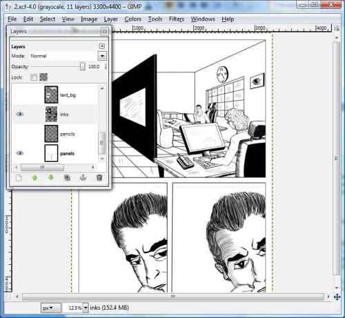
After typing in all the text (Font size – 50, Font – Comics San MS normal), I insert a layer above all inks layers, and just below the lowest text layer. I name this layer text_bg.

I draw all speech balloons and caption backgrounds on this layer. This makes it easy for me to make them disappear in one click later.

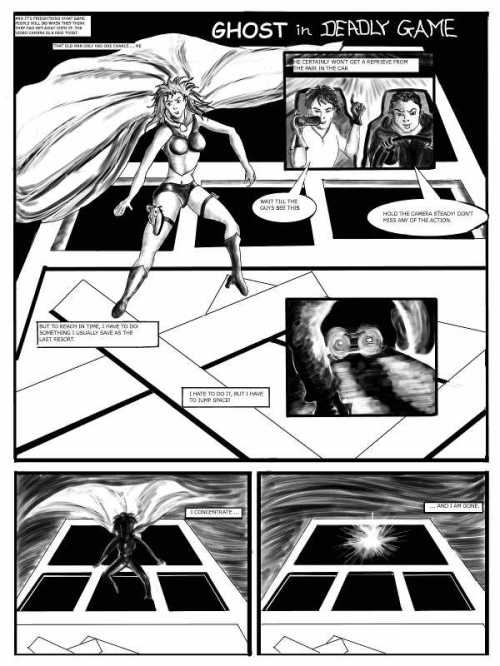
After all the text is typed, the page looks like the following.
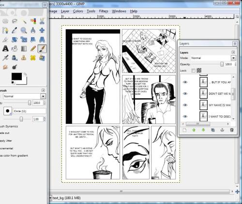
page_with_text

I select the text_bg layer, and start drawing balloons / rectangles on it. The process is repeated for all texts within the page.

1. Using the Selection tools, I drag an oval (for speech balloon) or rectangle (for caption) which will encompass the text. At this stage, a selection ‘running ants’ shape will appear around the chosen text, but everything below that text and the oval / rectangular shape will be visible. Draw the shape at such a size that the text below it will have some ‘breathing space’ (white space) around it.

2. Then I fill the selection with white color.

3. I keep the shape selected, choose the brush tool, select brush of size 5 pixels and keep black as foreground color.

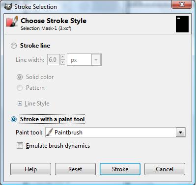
4. I click the menu items as follows: Edit -> Stroke Selection. The stroke selection dialog box appears. Choose the radio button against the ‘Stroke Selection’ option as shown below.
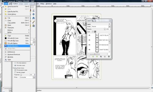
stroke_selection

stroke_with_paint_tool

This draws a 5 pixel stroke within the boundaries of selection. Now we have a background for our text.

5. I unselect the shape, and repeat this process for every text item, remaining on text_bg layer.

6. Now it’s time to draw tails for speech balloons. I draw fairly rough tails here, just to get an idea how the final ones will look. Select the text_bg layer, select brush tool, 5 pixel brush. Keep pressure sensitivity off, and draw the balloon tails freehand. Let them invade in the balloon space a bit. If you are fussy about the look (like me), you may fill them with white color, stroke with black color, and clean up the overlapping bits.

When this is done for the entire page, I save the file as a JPG image. This image serves as a reference when doing the actual lettering.

Now I make all text layers and text_bg layer invisible, and save the image as a TIFF file with maximum resolution. TIFF format employs a lossless compression (unlike JPG) and is ideal for final printing.

Now we have a full resolution image with no text and no speech balloons / captions. This image is ready for lettering.

Coming up – Lettering using Inkscape.
Read Full Post »

Two kinds of graphic formats are used in electronic mediums. Raster and Vector.

Raster graphics are stored as a bunch of pixels, while Vector graphics are stored as a bunch of shapes and nodes.

Raster graphics start losing their clarity as they are stretched beyond their original maximum size. Vector graphics can be (theoretically) stretched to any size without loss of clarity.

Vector graphics van also be used to draw precise shapes, since each stroke can be tweaked separately. But Raster graphics have a better color reproduction.

Photoshop and GIMP are examples of Raster graphics editors.

Illustrator, Inkscape, CorelDraw are some of the vector graphics editors.

Vector graphics can be exported to raster graphics.

Inkscape is a open source, free vector graphics editor I use for lettering. More on this in the workflow discussions.

Question: If vector graphics editors create so much accurate, scalable graphics, why don’t I produce the complete artwork in Inkscape?

Answer: That’s something on my agenda for future. Currently I am learning Inkscape.

Read Full Post »

Many of you must have read these terms ‘RGB’ and ‘CMYK’ in my previous post, and wondering just what they are.

Well, RGB and CMYK are 2 models of representing color. Typically, RGB model is used in web and screen colors, while CMYK is almost exclusively used in print medium.

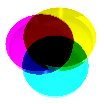
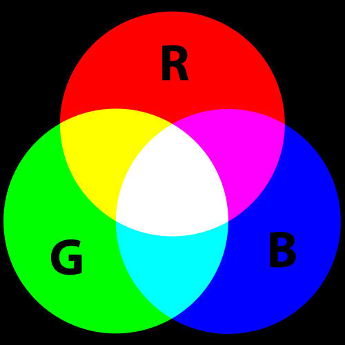
The following graphics show the color models in their representative form.

RGB

Additive Colors (Image courtesy wikipedia.org)

CMYK

Color-subtractive (Image courtesy wikipedia.org)

The abbreviation RGB stands for Red-Green-Blue. Every color pixel that we see on a computer / TV screen is a combination of various quantities of these three primary colors. When these three colors are mixed at their full strength, the color white is produced. That’s why, sometime these colors are called ‘Additive colors’.

Printing is a different ball game, though. When priniting on paper, the printers use inks of CMYK combination. CMYK stands for Cyan-Magenta-Yellow-Key. Cyan, Magenta and Yellow are the three ‘Subtractive Colors’ i.e. adding them together yields black color.

Every color printed on paper is a combination of CMY colors in various quantities. The ‘K’ in ‘CMYK’ stands for Key, which is a term used for black color. The reason the letter ‘B’ is not used for black is to avoid confusion with Blue in the term ‘RGB’.

Black color is separately mixed along with CMY combination while printing. Even though combining CMY colors yields black, it may not be a very neat effect due to impurities in inks, and any discrepancy on a black print is easily visible on paper. That’s why black is treated as a separate color and printed so.

The reason CMYK combination is used for printing on paper is why sometimes paper printing in color is sometimes referred to as ‘Four color printing’.

Sometimes, there’s a need to use a special color in very precise quantities while printing. This is achieved by adding the ink for that special color to the printing process. This is called ‘Spot Coloring’.

The color spectrum within CMYK world is not as rich and diverse as that of RGB. That’s why it’s quite possible that an image appearing brightly colored on screen may not be reproduced as it is on paper (on professional printers). The inkjet and laser printers may produce this RGB effect accurately, but the professional offset printers will not.

Read Full Post »

The illustrations, lettering and cover page for my first ever story are complete. Waiting for the test prints.

I don’t know when I decided to jump into comics / graphic novel stuff, but it has yielded some interesting results so far.

Currently, I have 2 stories written, one of them completed in the form of a small book. I am done illustrating, lettering and formatting for this story. Now this is done, I intend to get a few test copies published via a print-on-demand (POD) site (Pothi.com). This will help me visualize how the final book will look, as well as improve formatting before the complete book goes onto print.

I have yet to look for a publisher, but currently evaluating various options like professional publishers, self publishing and POD.

The second story illustrations have started and may take several months before I complete them. It’s a bigger story (approx 40 pages) than the first one (24 pages). But I have a definite advantage of experience, learning from my mistake and a definite workflow from the illustrations of my first story.

My first attempt at uploading the book and cover on Pothi.com failed due to the size restrictions at their end. This issue got resolved in a couple of days, enabling me to upload the stuff, and get my first hard copies ordered last week. Now I am waiting for them to arrive in mail.

The workflow

I do all my comics work digitally, even though I intend to print these in paper form in future. I use all free open source softwares for paneling and thumbnailing, drawing and inking (GIMP), lettering (Inkscape) and publishing (Scribus). I use my Dell Inspiron 1525 laptop with a Wacom Bamboo Fun 9″ x 7″ tablet.

The workflow is as follows:

Scripting (Tool – Wordpad)

It’s assumed that the script is complete before I even touch illustrations. The script is written in a consistent format with all the panels neatly planned, dialogues, captions and actions written in vivid details, though I may improvise on the go.

I typically write the script in a Wordpad document, so that I can edit it on any PC with MS Windows installed, and there’s no need for any special word processor for viewing it.

The script is written in a format consistent with the guidelines given on Dark Horse comics website. Since I started my experimentation in comics with a script provided by Dark Horse comics for aspiring artists, my script writing style is inspired by them.

Here are the experimental comic pages I did with the Dark Horse comic script.

Page 1

Page 2

Thumbnailing (Tool – GIMP)

This is a very important step in visualizing the content, even though it’s written in the script.

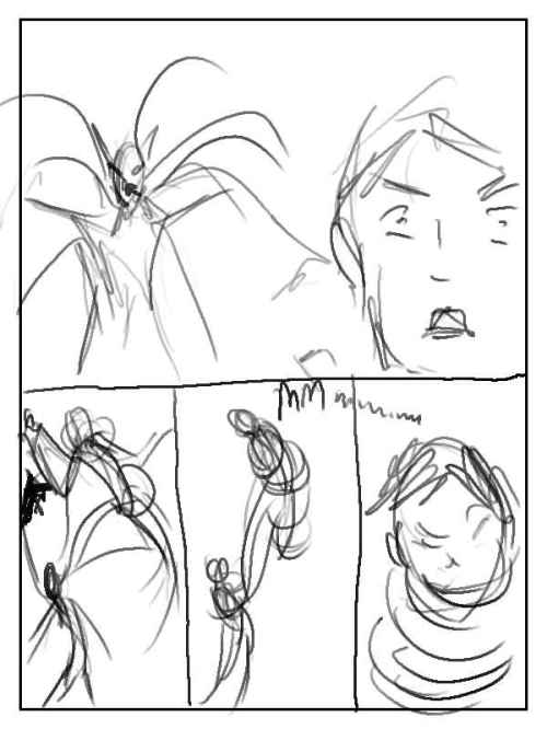
I have been doing thumbnailing in GIMP so far, but it may change. The thumbnails are very rough sketches useful for reference when I actually illustrate the comic pages. Even though the pictures look like they are drawn by a two year old, they are invaluable reference. They provide references for the camera angles, spaces for speech balloons and captions, and overall panels positioning. So when I am actually illustrating the page, these things become less taxing on mind, and I can concentrate on illustration quality.

thumbnail

Page Size

For the first story, the page size is 3300 pixels (W) X 4400 pixels (H) at 1,200 PPI. These pages are designed to be printed on A4 size / US Letter sized paper. The files are converted to Grayscale mode (Menu Item – Image->Mode->Grayscale) to make sure no other color accidently seeps in.

Paneling (Tool – GIMP)

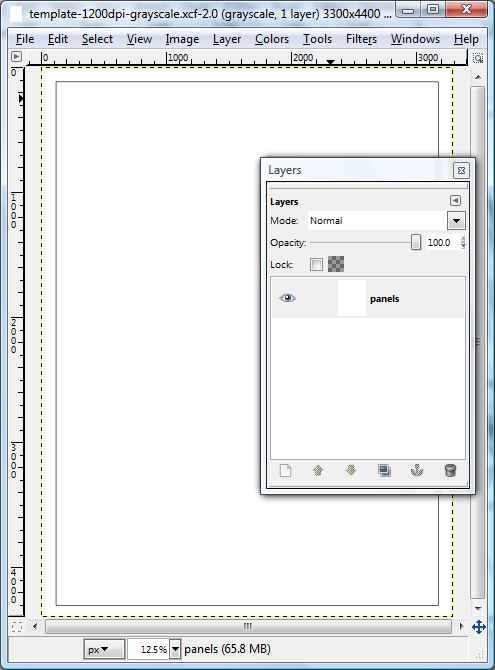
I rename the default layer with white background as ‘Panels’. Then I use the brush tool for drawing panels, with pressure sensitivity off, as shown in the following screenshot.

panels

Some comic artists prefer their panels to be above the illustrations, I prefer them below. It’s a matter of choice, and no approach is right or wrong.

I keep a template page (shown above) with a set size of a single big panel encompassing the maximum area covered by all illustrations on the page. I use this template for all pages within the story. This ensures that illustrations on all pages remain within the same area.

Penciling

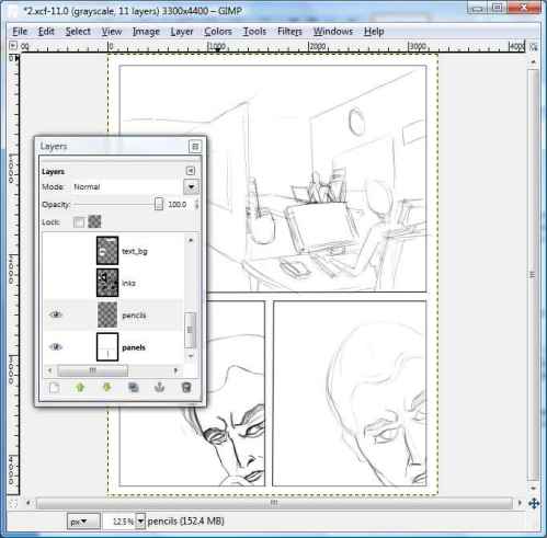
Once the paneled page is ready, I add a transparent layer on top of it, and name it ‘pencils’. I use the GIMP pencil tool for drawing the rough sketch. There’s no set rule on how much detailing I do in the pencil sketch. Sometimes it’s hardly a doodle, not so different from the thumbnail page, sometimes, it’s very detailed.

pencils

Inking

I create another transparent layer called ‘inks’ on top of the pencil layer, select ‘Ink’ tool from GIMP toolbox, and start inking.

One big disadvantage of using a tablet over paper is that one cannot rotate the virtual ‘canvas’ like paper. One can rotate the paper to convenient angles as suitable for ink strokes. So drawing perfect ink strokes requires some practice. Of course, this disadvantage pales in comparison to all advantages of working digitally (primary of which is cryptically called Ctrl-Z).

In the current comic stories, I have used perfect black and white shades only, and refrained from using gray shades. But this is very much possible by using the brush tool, as evident from my earlier work below.

shades

While doing inking, it’s a very good idea to periodically make the ‘pencils’ layer invisible, and have a long, hard, critical look at the inking work (which is going to be the final artwork). Sometimes, it’s easy to miss out certain strokes because the pencil work is showing through.

If there are complex overlapping elements, I create separate transparent ink layers above the basic ‘inks’ layer. This helps in making changes easier afterwards, as there’s no loss of data involved.

After the inking is done to my satisfaction, I make the ‘pencils’ layer invisible. This eliminates all the rough work from the final drawing in one stroke. Beats erasing bits from paper hands down, doesn’t it?

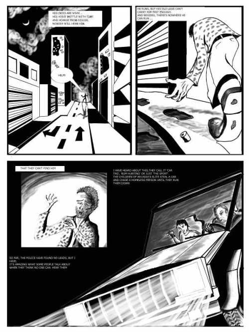
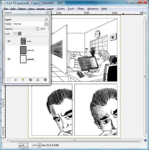
This is how the final page looks, after inking is complete.

inks

Coloring (If applicable)

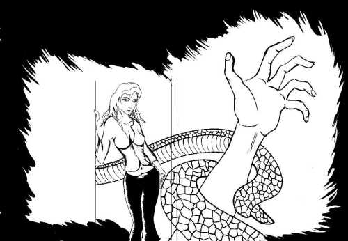
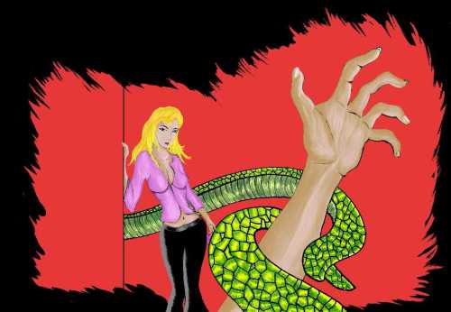
The reason Coloring is optional is because so far I have illustrated my stories in grayscale only, although I have done the cover page in full colors. Here’s a snapshot of the temporary cover page I created for my test copy. Note that this cover image is designed to be printed. So the front cover is on the right side, and back cover is on left side.

Both original Grayscale and colored versions are shown below.

cover_bw

cover_color

RGB Vs CMYK (More details on this in the future posts)

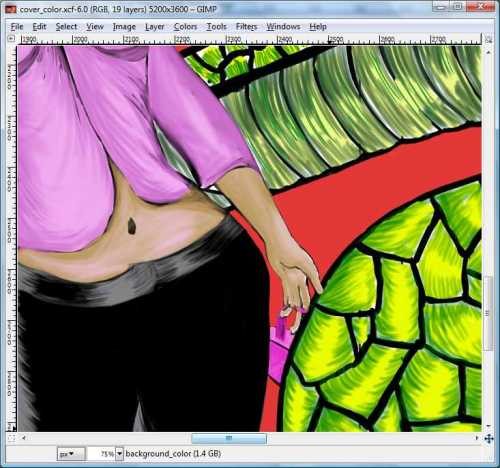
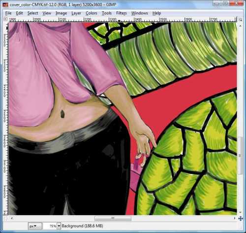
It’s very important that all colored images to be printed on paper are converted to CMYK format before being sent to the printer. Since CMYK has a much lesser range of colors, it may be difficult to visualize how the image will look on paper when viewed in RGB mode.

The following two images show the subtle color difference in RGB image and CMYK image.

RGB

cover_rgb

CMYK

cover_cmyk

More tips on Lettering and desktop publishing coming up in the next post.

Read Full Post »

Blog-Prologue:

Recession. Yes, that dreaded word which has taken the world by storm, has sent some rude awakening calls for ordinary folks the world over. Job losses, bankrupcies, frustrations and depressions abound.

And I am no different.

A part of the (so far) growing Indian IT industry, whose main clients reside in USA and Europe, it was impossible to be completely immune from the global meltdown. Luckily for me, I am still holding onto my monthly paycheque (It’s not AS brutal in India in terms of layoffs as in some western cultures), I was still worried.

Then it struck me.

Can this recession time be a blessing in disguise?

I have been sketching and painting for many years. In the eariler years, I had made some comics as well. But these comics were without any direction and real content. In my college and university years, I made many sketches (primarily portraits) and oil paintings (situations). One common factor amongst all these artworks was that they were always copied from various photographs and faithfully reproduced on paper / canvas. Even though many people around me liked them, it did not really satisfy me.

The recession and resultant free time gave me an opportunity to contemplate and think, to tinker with the part of brain clouded under stringent IT project deadlines.

First I tried out my hand at a small short film, followed by a claymation film, which proved to be quite an enriching experience. Making these films was the time when I discovered that I could write some interesting stuff, too.

More stuff about the making of my comic coming up

Read Full Post »